Alphacomm Brand Refresh

Overview
Tools

Problem
The existing identity needed a ground-up rethink. The logo, typography, and color palette had all aged out, and there was no cohesive visual system that could stretch across digital, print, and physical merchandise without losing consistency. The refresh needed to modernize every element of the brand while building in the warmth and character that a company built on human connection needed to project.

Process
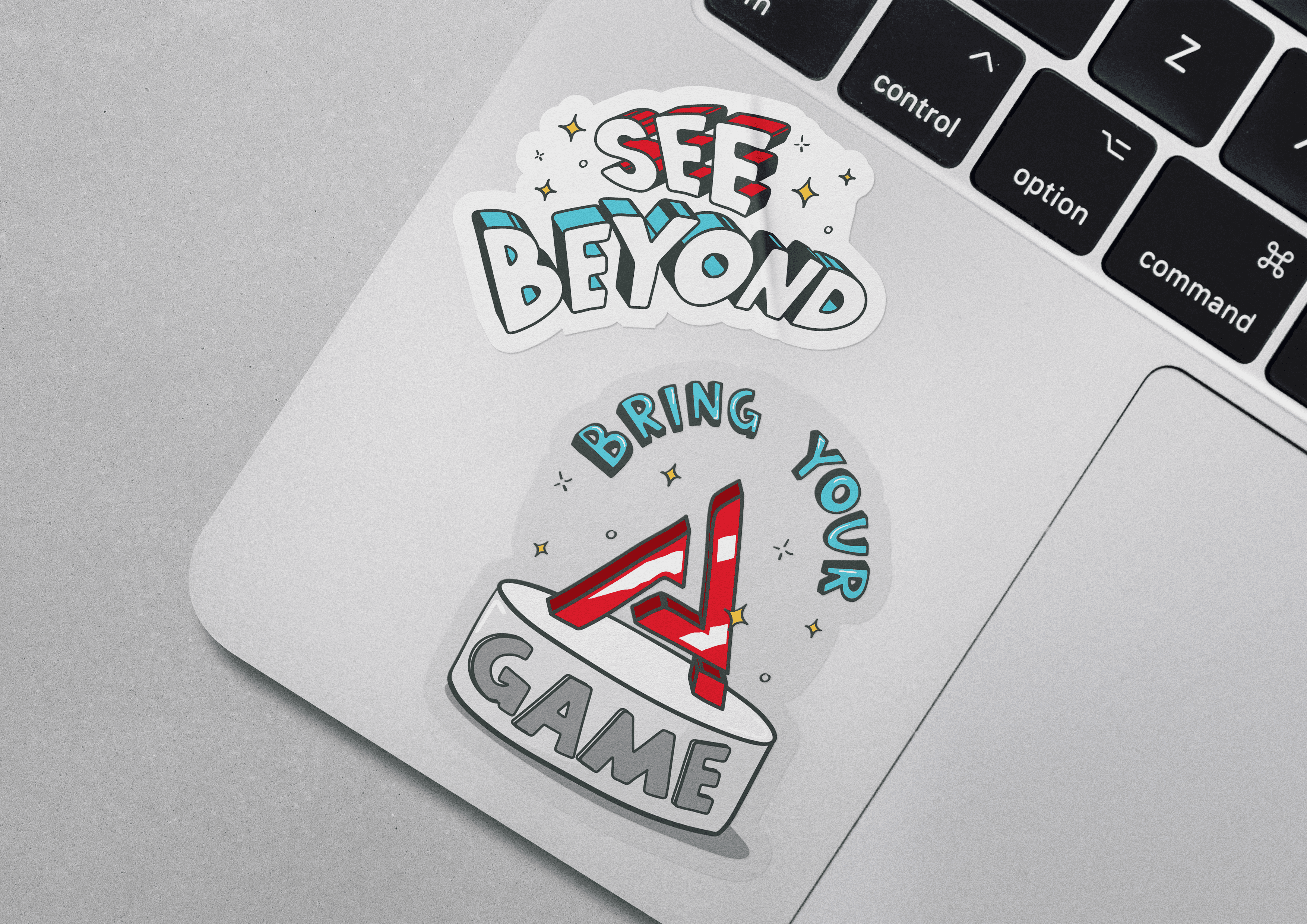
The hand-drawn direction came out of a collaborative conversation about what the brand needed to feel like. Once the direction was set, I took ownership of exploring what that looked like in practice, developing illustrations, icons, and patterns that had personality without feeling informal.
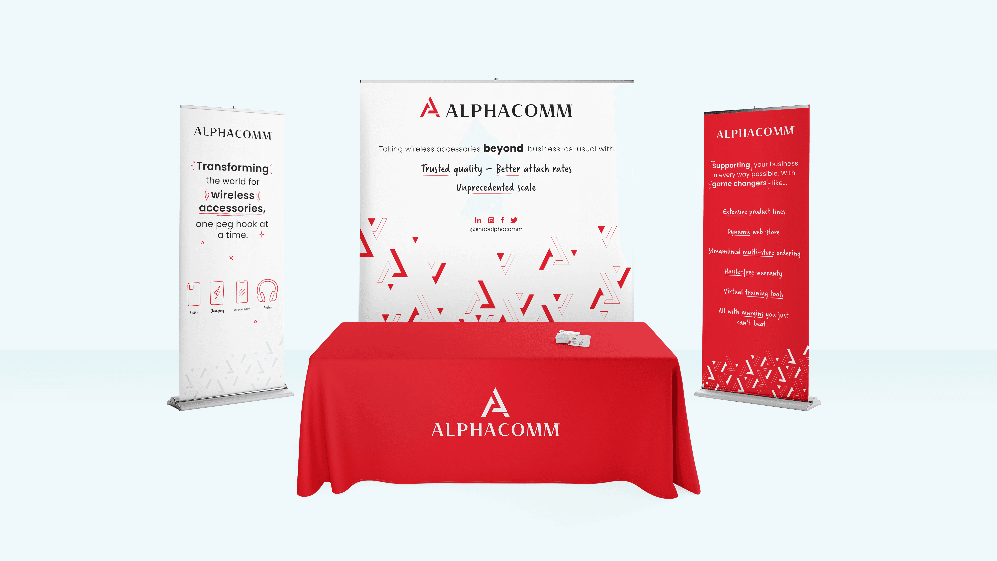
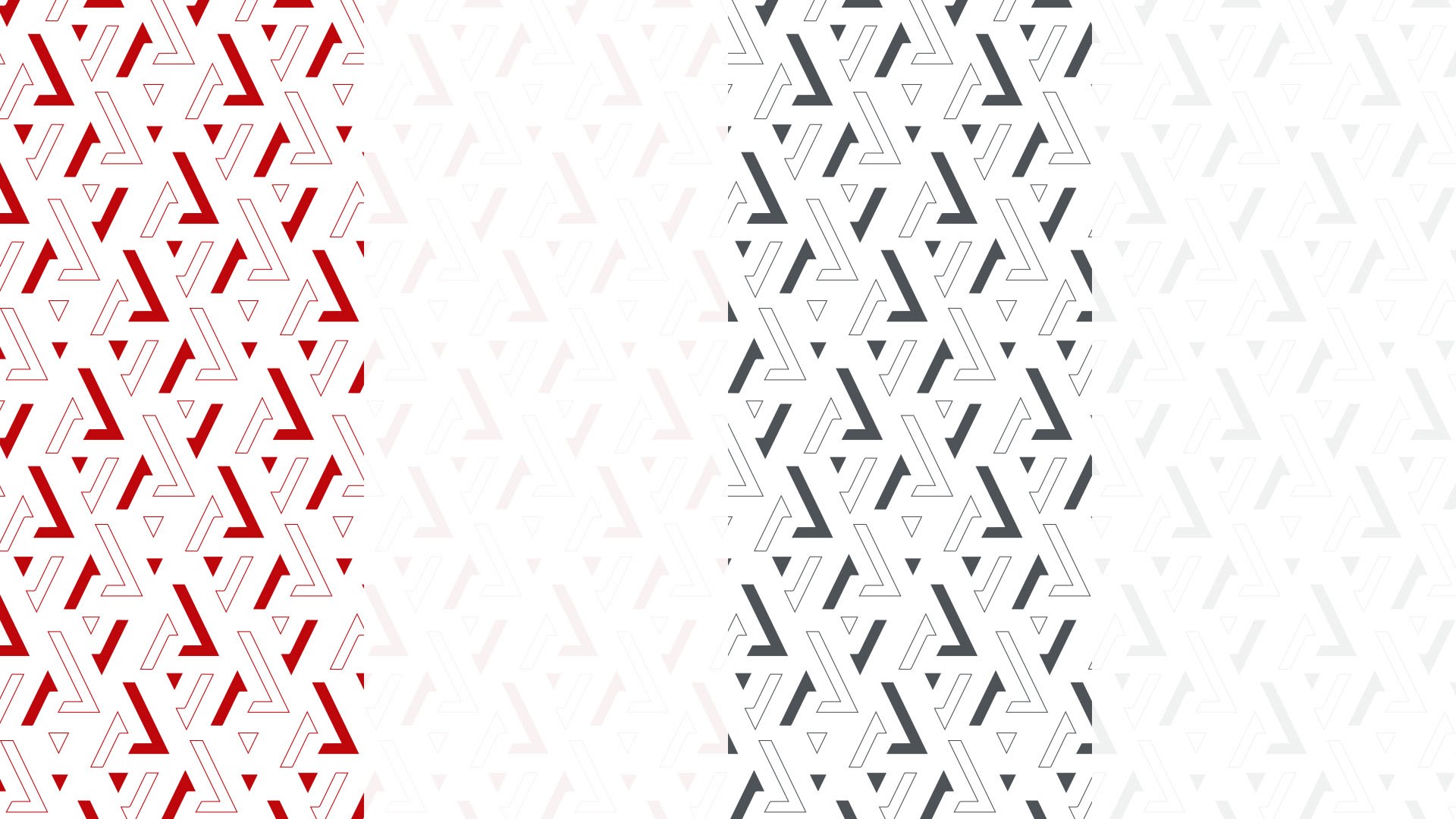
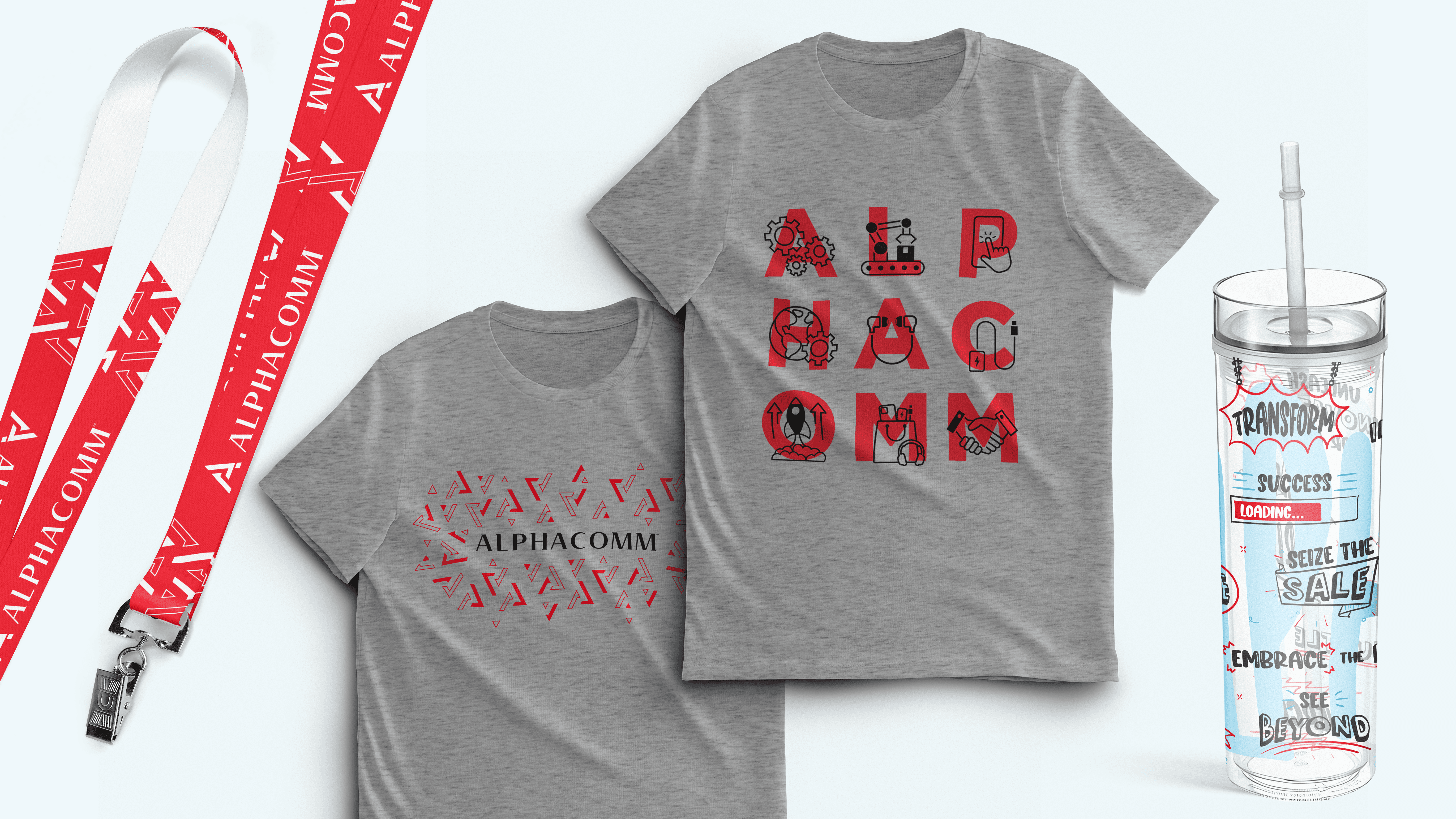
I designed two icon sets in parallel: a standard set for clear, scalable brand communications, and a hand-drawn set to bring warmth and humanity to touchpoints where personality mattered most. The brand pattern came from a close study of the logo mark itself, using stroke and fill variations derived from the existing mark to create something that felt native to the brand rather than decorative. That grounding made the pattern flexible enough to work across very different formats without feeling forced.
Once the visual language was established, I applied it across a full range of branded merchandise: t-shirts, tote bags, lanyards, hand sanitizer, tumblers, and stickers. The tumbler design drew from an illustration style used on the office break room wall, bringing an internal visual language into a physical product for the first time.


Solution
The result is a brand system with two registers: a clean, consistent visual language for professional communications, and a warmer, more expressive layer for moments where the brand needs to connect on a human level. Both registers share the same visual DNA, drawn from the same logo mark and color system, so the brand stays cohesive whether it appears on a slide deck or a tradeshow tote bag.
